Level up your Tailwind game

This article was featured in
- Issue #236 of Django News (Thank you!!)
Alright, this article might or might not be for you.
If you're the type of person that finds some Tailwind UI components and copies all the classes without any second thought, this might be for you.
If you're passionate about Tailwind and you appreciate getting creative with its utilitarian classes, this might be for you.
If you struggle with Tailwind and wonder why can't we just stick to plain old CSS, this might be for you.
If you don't like repetition and suspect that (besides wasting your time with the previous statements) some of the things that I'll show here are something you're already aware of, this might still be for you — repetition can't be that bad and I really tried to bring in something for everybody!
The idea here is to go through a Tailwind speed-run and find things that could help you use it more efficiently. And if nothing resonates with you, share with me in the comment section what did I miss :D
(And yes, the assumption is that you use VSCode, and occasionally Next.js for a thing or two, although a lot of these topics remain valid also with other frameworks.)
Let's get started then, shall we?
Before you proceed reading, let's make sure you are already using Tailwind CSS Intellisense (Opens in a new tab), because if you're not, you definitely should. It's impossible to remember all the classes that Tailwind offers, and a little help as we type them is really appreciated!
Speaking of classes...
Classes, classes everywhere!

Yes, let's make sure we start with the easy-peasy. Lots of people complain that Tailwind litters the project components with hecklots of classes, making it difficult to read through the component. To them I tell... have you heard of Tailwind Fold (Opens in a new tab) by Stivo (Opens in a new tab)? No? Now you have.
In his article about Hiding classes in VSCode (Opens in a new tab), our friend and constant source of inspiration Flavio Copes (Opens in a new tab) goes through a quick look at how this VSCode extension simply shows and hides the classes through a simple click.
While this is a worthy approach, you might not want to click to toggle classes visibility (I know I don't), and therefore the next suggestion would be...
Tailwind + Sass (and a sprinkle of @mixin if you will)
(We'll assume you're using Next.js, because, let's be honest, what else would you want to use if you had a choice?! I'm kidding, kinda :D)
We all love (I hope, otherwise why are you here?!) the power of Tailwind, but separating the functional part of a component from its styling is still a dream for many. The good news? You can achieve this by combining Tailwind with Sass! You just need to install Sass and everything will start working right off the bat!
Joaquin Collado, through Rootstrap (Opens in a new tab), has an easy guide on how to Use Module SCSS with Tailwind in Next.js (Opens in a new tab). Let's follow along!
First, install Sass
1npm install --save sass
Then, create the .module.scss for your components, e.g. Button.module.scss
1.button {
2  @apply p-4 rounded bg-blue-500;
3}
Import the styles in the component
1import styles from './Button.module.scss';
And finally use them in your React component
1/* ... */
2
3<button className={styles.button}>Click Me</button>
4
5/* ... */
Ta-da! 🎉 You will now be able, for most things, to separate the Tailwind classes from your component.
And you know what?! This approach allows you to use also the @mixin properties if you're used to them!
Mixins allow you to define styles that can be re-used throughout your stylesheet. They make it easy to avoid using non-semantic classes like
.float-left, and to distribute collections of styles in libraries.
— @mixin and @include (Opens in a new tab) explanation from the official Sass documentation (Opens in a new tab)
Have a look at this demo repository in CodeSandbox where you can see Tailwind + Sass + a simple implementation of @mixin in action (Opens in a new tab), or — if you prefer — test this implementation of Tailwind + Sass + @mixin locally by cloning it from GitHub (Opens in a new tab). The follow embed is also containing the aforementioned sandbox, but I strongly recommend checking it directly in CodeSandbox for ease of browsing and use.
The content that I'd like to show here comes from an external website, which has the potential to set a cookie on your browser and track you.
A third-party cookieis a browser cookie set by a website different from the one being visited (in this case, not from oh-no.ooo), and it's typically used for tracking and advertising.
In an effort to respect and protect people's privacy, I leave you the choice of accepting to see the embedded content here or check the content from the source. And well... you can also ignore it too, I guess, but dooooooon't, I promise I'll share only the best stuff! ♥
So, let's take it slow and check... what do we have here?
1// page.tsx
2import SassButton from "@/components/sassButton/sassButton";
3/* ... */
4<SassButton>Hello, I am a simple button</SassButton>
5<SassButton className="block mt-4" variant="cancel">
6    Me too!
7</SassButton>
8/* ... */
9<SassButton className="w-full m-2" variant="alert">
10    I am a variant that takes in both color and optional text color
11</SassButton>
We have a poorly-named SassButton component that can accept two props (ignoring the children, in our case the text we want our button to have), className and variant. Both props are optional, and while we get later to className and best practices on how to use that, let's focus on the variant part.
Now, moving to the button component
1// SassButton.tsx
2import cx from "classnames";
3import { FC } from "react";
4import styles from "./sassButton.module.scss";
5
6interface SassButtonProps {
7  variant?: "default" | "cancel" | "alert";
8  className?: string;
9  children: React.ReactElement | string;
10}
11
12const SassButton: FC<SassButtonProps> = ({
13  variant = "default",
14  className = "",
15  children,
16}) => (
17  <button className={cx(styles["button-" + variant], className)}>
18    {children}
19  </button>
20);
21
22export default SassButton;
we use the variant prop to determine what style the button will inherit from our sassButton.module.scss (which will be button-<variant_name>), and when no variant is set we just set its value to default.
Let's finally have a look at the Sass module.
1@mixin button-styles($button-bg-color, $button-text-color: "white") {
2  background-color: $button-bg-color;
3  color: $button-text-color;
4  @apply p-4 rounded;
5}
6
7.button-default {
8  // here you can pass the background color
9  // text color will use the default from the @mixin
10  @include button-styles(blue);
11}
12
13.button-alert {
14  // here you can pass both background color and text color
15  @include button-styles(orange, black);
16}
17
18.button-cancel {
19  @include button-styles(#ff0000);
20}
Our sass module starts with the overall shape and appearance of our button through the @mixin directive called button-styles, and it uses $button-bg-color and $button-text-color as variables to customize the color of the background and the text of the button.
Subsequently, we reuse the same setup by providing the variants default alert and cancel with the desired background and text color (the latter being optional and defaulting to white if nothing else is specified) by calling on button-style through the @include directive.
(Congratulations, you just had an absolute speed-run on how to use @mixin if this is your first time!)
Notice that with this approach nothing forbids us to use Tailwind classes at any point; we are already using simultaneously traditional CSS properties combined with Tailwind classes. Allegedly, no one could stop us from doing
1.button-cancel {
2  @include button-styles(#ff0000);
3  @apply text-xs underline;
4}
and it would be up to us to choose how to organize and create all the variants.
Heck, you might and think "why bringing @mixin up at all?" and in general I would say that Tailwind on its own is more than enough, but in a system that needs to contemplate multiple variants of the same component, @mixin could be the solution you were looking for — also, my objective with this article is to showcase more possibilities on how to work with Tailwind!
(Also... for some reason, I am not successful setting up a default value for $button-bg-color, if you know why let me know in the comments how to set all the parameters optional!)
So do you remember that className I said I was gonna mention again later? Now it's the time, for we are going to talk about...
The misunderstood art of managing space between elements and sections
If you're working with a good design system, I'd expect everything to be well-divided in sections and you being blessed with the consistency of everything spaced consistently throughout the project.
A good design system would have an atomic structure, where each smallest atom is a discernible component that may coincide to one or a few more HTML elements in the page that provide some value. Using these atoms/components together would form molecules, which would be the equivalent of a header, footer, sidebar — which all are sections of a website page — and a full page could be then considered an organism.
The reality is that most times, designers work in components and not in sections, meaning that there's no real concept of molecules, just atoms and straight into organisms. This implies that there is easily a lot of discrepancy on how much space there can be above an heading or below a section based on the rest of the content of the page if there is no clear demarcation of the end of a section and the beginning of another.
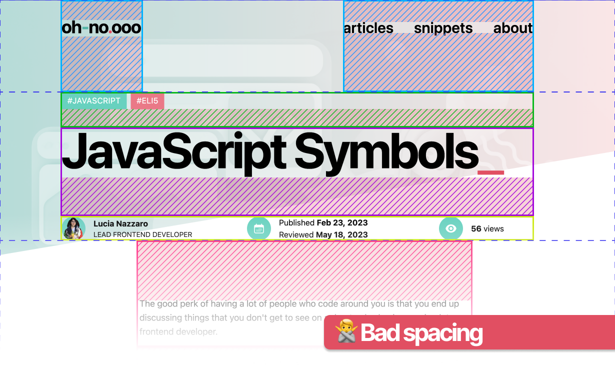
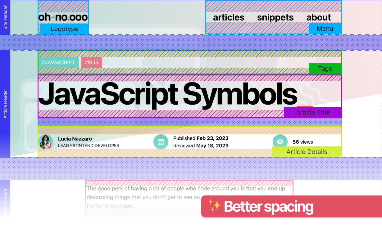
While we are not here to discuss about design systems (although I would anytime), I want you to acknowledge that components shouldn't directly take care of accommodating spacing based to their position in a page, but rather, they should be able to circumstantially receive and accommodate their spacing directives.
What do I mean by circumstantially? Nothing more than accepting classes related to the spacing that is needed for the page where the component will show up.
You can check this CodeSandbox to test how to give arbitrary spacing classes to a component (Opens in a new tab) or, like before, you can check how to give arbitrary spacing classes from this GitHub repository (Opens in a new tab).
Or you can quickly glance at it with the following embed.
The content that I'd like to show here comes from an external website, which has the potential to set a cookie on your browser and track you.
A third-party cookieis a browser cookie set by a website different from the one being visited (in this case, not from oh-no.ooo), and it's typically used for tracking and advertising.
In an effort to respect and protect people's privacy, I leave you the choice of accepting to see the embedded content here or check the content from the source. And well... you can also ignore it too, I guess, but dooooooon't, I promise I'll share only the best stuff! ♥
Let's dig into the code.
We have three different pages, app/pages.tsx, app/articles/page.tsx and app/about/page.tsx that make use of the same <HeaderTitle> component. The homepage uses the component without worrying much about its spacing in the page:
1// app/page.tsx
2
3/* ... */
4
5<HeaderTitle
6  title="Lorem ipsum"
7  description="This HeaderTitle component doesn't have any extra spacing setting"
8/>
9
10/* ... */
Meanwhile, both app/articles/page.tsx and app/about/page.tsx infer an extra className property that allows the <HeaderTitle> component to take up different space in the page.
1// app/articles/page.tsx 2 3/* ... */ 4 5<HeaderTitle 6 title="Lorem ipsum" 7 description="This HeaderTitle has some extra margin around it to fit better something like an article title" 8 className="my-24 mx-12" // we added margins for this page 9/> 10 11/* ... */ 12 13// app/about/page.tsx 14 15/* ... */ 16 17<HeaderTitle 18 title="Lorem ipsum" 19 description={ 20 <> 21 <ul> 22 <li> 23 This HeaderTitle shows how much flexibility you can have 24 </li> 25 <li> 26 while the component itself doesn't have to include natively any 'fixed' position 27 </li> 28 </ul> 29 </> 30 } 31 className="fixed right-0 top-24" // with this approach, we can also infer 32 // other styles related to the position of the element 33/> 34 35/* ... */ 36
The point here is that the code of the <HeaderTitle> component itself remains untouched and un-duplicated, while its spacing properties are relative to the contexts it gets used on, allowing for flexibility of usage across different pages and different needs.
You might want to argue now "couldn't we just wrap the component into another div whenever we need more space around it?", and while that is possible, it also creates extra elements that might create challenges while delivering semantic HTML. Also, it really helps us categorising which classes we need for its spacing and positioning, and which ones are for the component itself.
Which, guess what, leads us straight into the next topic!
Grouping by purpose for the sake of readability
It takes absolutely nothing to make Tailwind classes difficult to digest; you check one component's styling and all you see is a long list of classes and no quick glance will prevent you from mistakenly apply a second mx- class or so. Dang!
So, next in my personal recommended Tailwind best-practices, is to think about what each class is doing — layout, spacing, typography, colors, etc. — and group by that!
For example, instead of writing
1<div class="mt-4 bg-blue-500 text-white p-6 rounded-lg shadow-lg hover:bg-blue-700">
2  <!-- content -->
3</div>
You could organize them like this
1<div class="p-6 mt-4 rounded-lg shadow-lg bg-blue-500 text-white hover:bg-blue-700">
2  <!-- content -->
3</div>
Grouping similar classes together makes it easier to read and understand what stylings are being applied to the element.
If it sounds daunting as a task, worry not! Someone has already thought of a VSCode extension, Tailwind Raw Reorder (Opens in a new tab), that will take care of the sorting for you! (And apparently, it also works in module.scss files without any extra configuration!)
The order that the extension proposes is as follows (or at least ChatGPT think it is — at least I couldn't find this from anywhere else):
- Layout: container, box-border, box-content, etc.
- Positioning: static, fixed, absolute, relative, sticky, etc.
- Flex and Grid: flex, inline-flex, grid, inline-grid, etc.
- Spacing: m-0, p-0, space-x-0, etc.
- Sizing: w-full, h-full, max-w-full, min-h-full, etc.
- Typography: font-sans, text-sm, font-bold, etc.
- Background: bg-white, bg-opacity-50, etc.
- Border: border, border-0, rounded, ring, etc.
- Effects: shadow, opacity-0, etc.
- Transitions and Transforms: transition, duration-300, ease-in, scale-100, etc.
- Miscellaneous: cursor-pointer, select-none, etc.
You can read more about the development journey of Tailwind Raw Reorder on Reddit (Opens in a new tab), where people talk also about the official recommendation for Automatic class sorting with Tailwind (Opens in a new tab) (which I don't recommend anymore because it only sorts classes alphabetically, although I wouldn't necessarily diss, as I did like the combo of Tailwind + Prettier it when I discovered its existence).
It is fair to note that Tailwind Raw Reorder (Opens in a new tab) by Andrew Trefethen (Opens in a new tab) is a fork of the now dated Headwind VSCode extension (Opens in a new tab).
Well damn, if this isn't all that you need to make the most out of Tailwind in a smart way!
But wait! There's more!
Tailwind Merge to the rescue
While I've already written a small snippet about Tailwind Merge, let me reiterate here what's for.
Like the name suggests, tailwind-merge npm package (Opens in a new tab) by Dany Castillo (Opens in a new tab) offers a solution that combines and reuses Tailwind utility classes.
Suppose you have a button component that can be either primary or secondary, with different styles for each state, some styles taken from a button.module.scss and perhaps with something else inherited by className as we have seen possible with the earlier examples.
(oh god, what a mess — I am legally obligated to mention the classic "Your scientists were so preoccupied with whether or not they could that they didn't stop to think if they should.").
Instead of having to figure out whyyy is the padding not working as you'd expect, you can use tailwind-merge and give hierarchy on how all the various classes take priority.
1// button.tsx
2
3import { FC, ReactNode } from 'react';
4import { twMerge } from 'tailwind-merge';
5import styles from './button.module.scss';
6
7interface ButtonProps {
8  type?: 'primary' | 'secondary';
9  className?: string;
10  children: ReactNode;
11}
12
13const Button: FC<ButtonProps> = ({ type = 'primary', className, children }) => {
14  const baseClasses = 'p-4 rounded-lg';
15  const typeClasses = type === 'primary' ? 'bg-blue-500 text-white' : 'bg-gray-500 text-black';
16
17  return (
18    <button className={twMerge(baseClasses, typeClasses, styles.button, className)}>
19      {children}
20    </button>
21  );
22};
23
24export default Button;
Assuming a fictitious button.module.scss containing
1// button.module.scss
2
3.button {
4  @apply text-xl;
5}
The button will eventually have the following classes
1'p-4 rounded-lg bg-red-500 underline text-xl text-white'
This approach eliminates potential conflicts and contradictions and hopefully keeps your elements rendered with fewer clean(er) classes.
The one caveat of Tailwind Merge, imho, is that you would have to start using it at the beginning of a project; however, nothing prevents you from progressively add it into the codebase.
Now, what else? Well, there's plenty!
Speed it up with component libraries
We all like to keep rebuilding the wheel, as every project proposes different nuances and we just want that button to work exactly as we had it envisioned. But the key to a successful "I build it my way" is to know when to build and when to borrow.
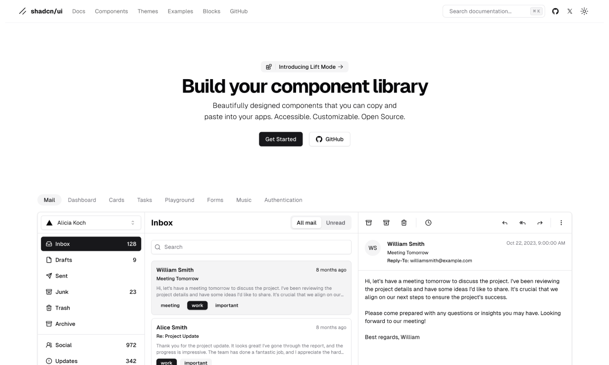
shadcn/ui (Opens in a new tab) offers a great set of components (styled with Tailwind) that you can take as-is and customize all while they already include some accessibility contemplations. It differs from other libraries as it invites you to be hands-on the actual component and it allows you to modify it to your exact needs without having to create extra levels of abstractions for customisation.
It is worth to note that, like everything, it is not perfect and sometimes you might want to rewrite a couple of things here and there.
For example, its class handling proposes a mix of clsx and twMerge that might be redundant, as described by Pablo Haller (Opens in a new tab) in his article Something I don’t like from shadcn/ui (Opens in a new tab).
That being said, shadcn/ui is a great way to speed up your work, especially combined with some good Figma prototyping made simple for you by Pietro Schirano (Opens in a new tab) with their Figma @shadcn/ui - Design System (Opens in a new tab).
And while shadcn/ui is a great free solution to implement ready-made-tailwind-styled components, you might want to use a more mature system such as Flowbite.
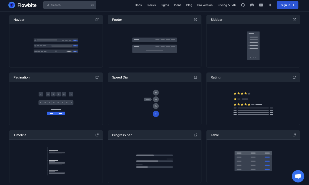
Flowbite (Opens in a new tab) (whose main contributor is Zoltán Szőgyényi (Opens in a new tab)) is a component library that is also built on top of Tailwind CSS. It provides a broader set of UI components that you can easily integrate into your Tailwind projects and it really helps you making everything look professional and curated from the very beginning.
On top of everything, Flowbite proposes a lot of videos that help you navigate the new ecosystem, as well as a lot of constant updates to their product, which we know is something we desire in a system that we want to implement and hopefully use for a long time.
If you want to familiarise with a great design system but you're not ready yet to make a monetary commitment, Flowbite is the right resource nonetheless. They offer also a free version of their Flowbite Design System (Opens in a new tab), which can help you speed up your prototyping and design process while keeping high-quality mockups — and eventually figure out if Flowbite is the solution you were looking for.
Let's talk about forms
Got no time to make that form pretty? Worry not, because Tailwind Forms (Opens in a new tab) can come to the rescue to style in a consistent manner all your forms!
It provides base styles for form controls like inputs, text areas, checkboxes, and radio buttons. You could easily decide to install this plugin and forget about handling form styling, for real!
You can simply install the plugin
1npm install @tailwindcss/forms
add it to your tailwind.config.js
1module.exports = {
2  //...
3  plugins: [
4    require('@tailwindcss/forms'),
5  ],
6}
and that's pretty much it! Wanna customise something more because you really want that gradient background? Feel free to add some extra styles to the form elements like you normally would!
Be sure to check out the Tailwind Forms documentation (Opens in a new tab) and be sure to checkout the Tailwind Form example (Opens in a new tab) they provide!
Snippity snippets!
I'd like to end this article by shining some lights on other majestic work that people have done and shared.

You can find a ready-made collection of templates in Tailwind UI (Opens in a new tab), developed and curated by the very same creators of Tailwind. It's a nice mature collection of components and templates, with the only downside that it will cost you some money. But hey, quality stuff nevertheless!
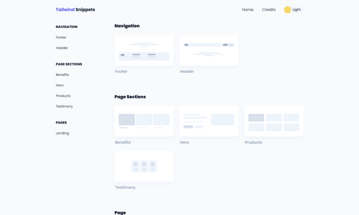
Tailwind Snippets (Opens in a new tab), as it mentions in their homepage, proposes a collection of UI templates to speed up your UI development using React and Tailwind CSS. Quick and easy to browse, find the elements you need and copy away!
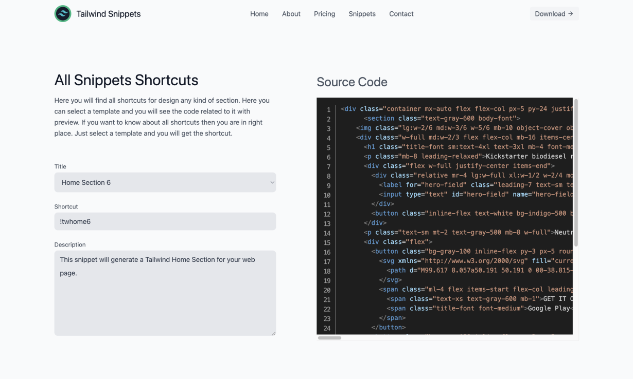
With the same name but with a VSCode extension coming along with it, Tailwind Snippets (Opens in a new tab) is a VSCode extension that allows you to take advantage of the numerous snippets available in Tailwind Snippets (Opens in a new tab) and developed by ZS Software Studio (Opens in a new tab).
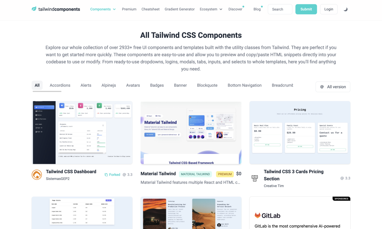
On the same note, you'll find Tailwind Components (Opens in a new tab) with its community-shared free-to-use components... all the options!
And these are just a few of the ready-made snippets you can copy away. Do you have a favourite one, or am I missing out on something good? Please share!
I hope you found some good resources in this article, and that ideally you might have learned a thing or two. If you have any questions or additional tips, drop a comment below!

